The Romantic Era (late 1800s to early 1900s) was a time where art began to take on many different styles. Up until this point, art was always the style of what people wanted at the time. Mostly realistic or idealized commissions. Historical moments were captured in great detail as if it were a photograph. However, in this era came the first cameras. Though they were slow and the technology was still developing, the need to have portraits made began to fade. I believe this contributed to a freedom of the artist to express themselves with new techniques in art.
I'd like to compare two different art styles from this era: impressionism and art nouveau.
Impressionism was an art style developed by a group of artists who chose to create works exhibiting more personal creativity and expression than recreating historical or biblical stories. Some founding members included Claude Monet and Berthe Morisot.
The Japanese Footbridge by Claude Monet (France, 1899) is a textbook representation of an impressionist painting. Impressionism not only focused on the artists personal expression of what they were seeing, but also in the use of transitory light and color. Here the whole image comes together to show the landscape of the bridge and water flora but, when you view it closely, you can see the muddled and often thick strokes used to convey texture and depth. So though the painting is filled with detail, it's not a fine and realistic detail from previous periods of art. It is, as the style suggests, an impression of how the artist sees their view.
In comparison, the nouveau style was more focused on long, bold lines. It, similarly to the impressionist style aimed to turn away from traditional art that depicted historical and biblical scenes. Though short lived, it gave way to graphic design in the form of posters and advertisements.
Summer by the Czech artist Alphonse Mucha (1896, France) was part of the series Seasons in which Mucha painted a woman to represent each season. Though Mucha, rejected the title of art nouveau, his work is associated with the title.
An element that is distinguished in the art nouveau style is the asymmetrical lines. As you can see in Summer, the vines from the water curve and bend in a way free of conformation. There are bold lines outlining the details of the woman and the poppies in her hair definitively bordered. Though both suggest imagination in their artwork, the nouveau period keeps a style of clear lines and less visible brushstrokes.

Coming back to the impressionist style with Berthe Morisot's After Luncheon (1881, France), there is a clear lack of lines and confined color. Unlike how nouvea has clear borders and colors that stay in their designated place, Morisot's impressionist style features absolutely no borders and allows the colors to be transient, mixing together. The brushstrokes are very bold and it's clear that the painting has texture, as if you can feel that a lot of paint was used. The painting evokes a feeling of being messy up close, but from a distance everything feels like it comes together. Becoming a soft, peaceful image.

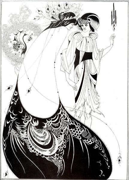
Another defining artist of the art nouveau style was Aubrey Beardsley. His ink on paper illustration The Peacock Skirt (1883, Britain) shows those distinct, free-moving lines that fall into the nouveau category. This artwork was part of a series of images created for Oscar Wilde's play Salome. Which comes back to another theme of art nouveau illustrations; many were advertisements. So while imaginative and expressive, many works were created for the purpose of making money. Unlike impressionism which took some time to become understood and popular.
Art nouveau is my favorite style of art. I have spent over $40 USD to get custom phone cases with some of Mucha's famous paintings. As well as my Mucha calendar from 2022. The curves of the lines and the abundant featuring of women in this style stands out to me and I love having the artworks around. Though I do enjoy and appreciate impressionist work (I have a notebook with The Japanese Footbridge printed on) it is definitely not my favorite style of art. While the colors are enjoyable to look at, and the way they blend is something to admire, I prefer the strong lines and minimal visible brushstrokes of the art nouveau style.
Images:
Citations:
Britannica. “Impressionism | Definition, History, Art, & Facts.” Encyclopædia Britannica, 22 Jan. 2019, www.britannica.com/art/Impressionism-art
Invaluable. “10 Art Nouveau Artists Who Defined the Movement.” Invaluable, 25 Apr. 2018, www.invaluable.com/blog/art-nouveau-artists/
Encyclopedia Britannica. “Art Nouveau | History, Characteristics, Artists, & Facts.” Encyclopædia Britannica, 7 Feb. 2025, www.britannica.com/art/Art-Nouveau
Mucha Foundation. “The Seasons: Summer - Browse Works - Gallery - Mucha Foundation.” Muchafoundation.org, 2025, www.muchafoundation.org/en/gallery/browse-works/object/82/
Britannica. “Impressionism | Definition, History, Art, & Facts.” Encyclopædia Britannica, 22 Jan. 2019, www.britannica.com/art/Impressionism-art.
Britannica. “Impressionism | Definition, History, Art, & Facts.” Encyclopædia Britannica, 22 Jan. 2019, www.britannica.com/art/Impressionism-art.
Britannica. “Impressionism | Definition, History, Art, & Facts.” Encyclopædia Britannica, 22 Jan. 2019, www.britannica.com/art/Impressionism-art.


The two types of art that you compared for your blog are so completely different than each other. What a great selection. I’ve reviewed all of the class blogs and it looks like you are the only one to select impressionism and art nouveau. I personally really like impressionism. I feel like if I squint my eyes the picture comes into focus. Art nouveau is attractive but not my preferred style. I think that you did a good job explaining the intentions of both styles. Both styles focused on the artists’ personal perspectives, but you also described how each style was different. I hadn’t made the connection between art nouveau and graphic design. I can see how art nouveau lead to graphic design because of the lines and colors.
ReplyDeleteI found the paintings you chose interesting because I can see and compare the different techniques each artist used. For example, the brushstrokes and the approach to light of Impressionism, like the paintings of artists Monet and Morisot in comparison to artists Alphonse Mucha and Aubrey Beardsley, since their art is lighter. I loved reading your personal connection to Art Nouveau. I must also say that Monet is not my favorite artist, but I liked the painting of The Japanese Footbridge and its meaning. I also find it very inspiring. It's funny that you chose the same painting as me, but I still find it interesting to see different opinions, and I'm glad you chose it too.
ReplyDeleteI like the way you set up your comparisons. I spent a great deal of time studying Monet, and while this wasn't my favourite of his waterlilies, it is still beautiful to study and just wonder what was going through his head as he kept painting them. Before he died, he was commissioned to build a piece that would fill a whole room at a museum, but he was getting older, and it was getting harder to paint like he used to. He refused to give up the paintings, and they were not put on display until after his death. The painting 'Summer' was a nice choice, I wouldn't have thought to look at it that way. I wasn't a huge fan of the Impressionist style, but I do enjoy it in small amounts. You managed to find one that was just the right amount of colours that flow together to make it pleasing for the viewer. For the 'Peacock Skirt' kind of caught me off guard. I liked it, and the way it flows, I think it would have been better with a little more detail to the rest of the painting. But overall, I enjoyed your comparisons and can see that you put a decent amount of thought into them.
ReplyDelete